Loyalist College redesign
Power in small numbers
Situation
My role
-
UX designer
-
UX researcher
-
Analytics reporter
My team
-
Project manager
-
Content strategist
-
WordPress tech lead
-
Front end developers
-
QA engineers
Brief
Loyalist College sought to re-design their website to showcase their 'small can lead to big things' motto in a contemporary and exciting way. Together we created a user-centered, accessible website that supports student recruitment and engagement while showcasing their new brand identity.
Challenge
Loyalist College had several concerns: a huge backlog of tech debt that needed an overhaul, complaints about the current website from current and prospective students and staff, and a rebranding that needed to be reflected on a newly designed website.
The college is located in a small town and wanted the new website to highlight the power of 'small' and to reflect the campus feeling of inclusion and support.
Project process
The Loyalist College website redesign project was done as a partnership with EvolvingWeb, a web and design agency. As a member of the design team, I was involved in the kick-off and led the UX activities, before collaborating with the UI designer. During the UX design phase and development stages, I worked closely with the Wordpress developers and tech lead. Loyalist College also had included a maintenance contract, so analytics were put in place for further monitoring and improvement.
Kick-off
UX discovery
UX design
UI design
Validation
Development
Maintenance
Design framework process
In the majority of my work, I use the classic double diamond process. It is a valuable framework that I can use, re-use, and rely on to guide my process. Expand, contract. Cast a wide net, process insights. It helps to keep me on track and focused on the issue without going too off the deep end. You can read more about my design process over here.
diverge
converge
diverge
converge
How does this translate into design work?
Discover
Worskops, surveys, benchmark research
Define
Turn those into productive insights
Develop
Ideate, wireframe, explore solutions
Deliver
Synthesize design decisions, get validation
UX discovery activities & process
Understanding the current website situation
With the budget and extremely tight time constraints (they had a legal obligation to meet the go-live date, so there was no room for error on the design or development's side. We chose to use our resources to conduct:
01
Stakeholder survey
I created a Survey Monkey that was sent out to stakeholders to help clarify the vision of the new website, the audience and business goals.
02
Benchmark analysis
Working with the stakeholders, I selected several college and universities websites to idenitfy possibilites and opportunities.
03
User persona workshop
With my digital strategist, I conducted a workshop with current students and staff to identify pain points and better leanr their needs and habits.
Survey and benchmark analysis expectations & results
Understanding business goals and the industry
Here I identified main themes, the audience prioritization, the business goals of the website, as well as what the stakeholders wanted to get out of the new website.
Main themes
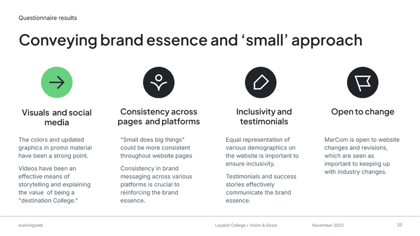
There was a strong consensus that information was hard to find; a major information architecture overhaul would be in order. The need to demonstrate the college's values, various campus', programs and innovation while being a small, vibrant community was a top priority.
Audience prioritization
Not a lot of surprises here, the primary audiences identified by stakeholders were current and prospective students and staff. Of course, there are a lot of secondary and tertiary audiences involved such as donors, parents, etc, but this survey is useful to re-align stakeholders at later phases of design and iteration. One thing that came up in discovery was the urgent need to improve the experience for foreign prospective students.
Business goals
As with most higher education institutions, one of the main goals was to drive enrollment for prospective students. Surprisingly, we learned through the survey that improving the discoverability of student life content and documents for students and staff was a high priority as it was negatively impacting the student experience. Additionally, communicating the Loyalist brand and philosophy was important. They wanted to translate the campus vibe into an online experience. Small, but strong.
Discovery material
User persona workshops results and validations
Talking to students (8 participants), staff, parents and community members (12 participants)
For the workshop, I prepped a FigJam board with the various personas. As a group, we assigned names and photos to each persona after an icebreaker. We went through each of the assumptions I had going into the workshop about motivations, goals, and pain points. The workshop members could agree or disagree and add their own sticky notes, and then we discussed them together.
A huge surprise: the younger group of students had the most technical challenges. I made a note to allocate more time to introduce FigJam in the future and allow students time to connect.
The 5 domestic students were a mix of first-year, second-year and graduating students. The primary pain points that they discussed involved confusion over program details and not being able to find information about courses of the campus online. All said it was easier to go ask in person at the Student Services offices. Graduating students could not find important documents and info relating to graduating and diplomas online. What I'm hearing is that there is a lot of work to be done in the information architecture that I will assist with my digital strategist on the team.
The 3 international students were first-year and graduating students. Overwhelmingly, they discussed confusion about international requirements, which programs were open to them, which programs were available on which courses and how to integrate into student life upon arriving on campus.
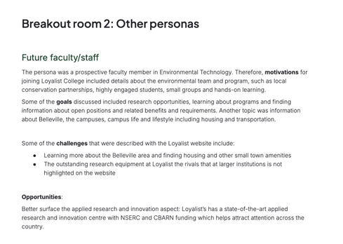
The faculty and staff all reported similar issues with finding relevant, updated information pertaining to job postings and career possibilities. Loyalist College does use a separate platform for careers so the job application section was out of scope but I did learn where we could provide more insight and guidance about locations, campuses and career paths before prospective faculty and staff go to the external platform. They also said they wanted to learn more about the main campus in Belleville and what life would look like living there.
Define discovery activity insights to design decisions
Because the international students, whom Loyalist College are trying to recruit, are having such challenges finding the information they need, I surface it in the utility navigation and make a distinct category for their needs in the dropdown menu.


Due to responses from stakeholders, students, and staff reporting issues with being able to find information and documents in a reliable and expected way, I work closely with the digital strategist. Together we looked at the discovery activities and re-organized the website information architecture. At this time, I only looked into Loyalist College's Google Analytics to see the user paths and pain points in the data. I was able to review the last 6 months of data and made a data analysis report that I delivered to stakeholders to further support the design decisions.

Wireframes
Wireframing is an essential collaborative process.
Deliverables included:
-
Home page
-
Life at Loyalist page
-
Program list page
-
Program detail page
-
Media centre page (news and events aggregate)
-
News & event detail page
-
Policies page

Translating insights and WordPress development into design decisions
Development collaboration & resource trade-offs
Working with the project's solutions architect, we identified early on that given the budget we had to work with, we would be relying on WordPress plugins for the event details cards and events calendar.
The architect shared a WordPress playground environment with me to understand the limitations and I designed the wireframes around the WordPress plugin functionality.

WordPress example

Figma component I created for wireframe and UI structure

This means we could have more resources allocated to more impactful elements, such as the homepage and the very information-heavy program detail page.
-
The naviagation and wayfinding was critical. The user is now several layers deep and I ensured with the tech lead that a student could return back to their search results without losing their filters. The breadcrumbs are visible a third-level pages (Home / Parent page / Child page) to ensure the visibility of system status.
-
The primary call-to-action item is 'Apply' which leads to the provincial government application site and was out of our scope (it's a UX nightmare). Stakeholders has mentioned wanting students to 'Book a visit' as campus visits can lead to higher enrollment conversions.
-
One of the main pain points brought up by stakeholders in the survey and students in the user persona workshop was confusion regarding what campus the program is located, if the program is open to domestic or international students, and during what semester the course is offered. I surfaced this information so students can quickly understand this and make more decisions.
-
Again, the navigation was critical to get this correct. I re-used the 2 column layout with side navigation, which sticks to the top of the screen as the user scrolls. Now, students (or parents and guidance counsellors) can quickly see requirements, course content and costs. The order of this side navigation was guided by workshop feedback and validated by the stakeholders.
-
Student feedback from the workshop emphasized a need to easily understand and access the costs for domestic and international students, so I make a clear distinction in the accordions which also served to save a bit of vertical real estate.
-
A primary business goal was to highlight the campus and student experience. To add impact, I included space for the many alumni testimonial quotes and videos. Loyalist College also included an external widget by Lightcast Data that were part of the wireframe requirements.

5

6
Colours and typography


Deliver solutions alongside the creative direction
Validate with stakeholders
I am not a UI designer or an art director. Luckily, I worked with an incredibly talented team member who is both of those things. They led the artistic vision and we collaborated on ensuring the UI design kept in line with the wireframes.


Final results and next steps
Here is the homepage in production.
Here is the case study written by EvolvingWeb.
The analytics were updated into Google Analytics 4 so that we could monitor user activity and find places to optimize the user experience and journeys. The stakeholders were thrilled with the results, and the team and myself were equally pleased with the output of our efforts.


